 RSS Feed
 by Calculated Risk on 12/05/2014 04:47:00 PM
Friday, December 05, 2014
The Future's so Bright ...
Almost two years ago I wrote The Future's so Bright .... In that post I outlined why I was becoming more optimistic. Now that 2014 is the best year for employment since the '90s, it is time for an update!
For new readers: I was very bearish on the economy when I started this blog in 2005 - back then I wrote mostly about housing (see: LA Times article and more here for comments about the blog). I started looking for the sun in early 2009, and now I'm more optimistic.
Here are some updates to the graphs I posted two years ago. Several of these graphs have changed direction since I wrote that post. As example, state and local government employment is now increasing, and household deleveraging is over (as predicted).
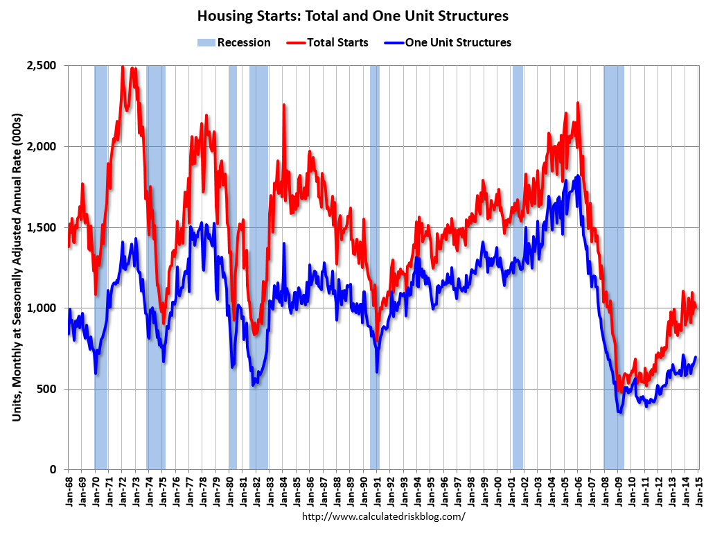 Click on graph for larger image.
This graph shows total and single family housing starts. Even though starts have almost doubled from the bottom, starts are still way below the average level of 1.5 million per year from 1959 through 2000. As of October, starts are still close to the bottom for previous recessions.
Growth for starts in 2014 was slow, but that just means there is more growth ahead. Demographics and household formation suggests starts will increase to around 1.5 million over the next few years. That means starts will probably increase another 50% or so from the October 2014 level of 1 million starts (SAAR).
Residential investment and housing starts are usually the best leading indicator for the economy, so this suggests the economy will continue to grow over the next couple of years.
 This graph shows total state and government payroll employment since January 2007. State and local governments lost 129,000 jobs in 2009, 262,000 in 2010, 249,000 in 2011, and 33,000 in 2012.
In 2013, state and local government employment increased by 44,000 jobs.
This year, through November 2014, state and local employment is up 96,000. So, in the aggregate, state and local government layoffs are over - and the economic drag on the economy is over.
 And here is a graph on the US deficit. This graph, based on the CBO's recent projections, shows the actual (purple) budget deficit each year as a percent of GDP, and an estimate for the next ten years based on estimates from the CBO.
As we've been discussing, the US deficit as a percent of GDP has been declining, and will probably remain under 3% for several years.
Here are a couple of graph on household debt (and debt service):
 This graph from the the NY Fed shows aggregate household debt has increased for the last 5 quarters.
From the NY Fed: Household Debt Balances Increase as Deleveraging Period Concludes
Total cash flow from mortgage debt and nonmortgage debt combined (black dotted line) has turned slightly positive during the past four quarters, ending a five-year period of negative values, suggesting that, by this measure, the deleveraging process has ended; households have begun to use credit to supplement their cash flow again.There will be some more deleveraging ahead for certain households (mostly from foreclosures and distressed sales), but in the aggregate, household deleveraging is over.
emphasis added
 This graph is from the Fed's Q2 Household Debt Service and Financial Obligations Ratios. These ratios show the percent of disposable personal income (DPI) dedicated to debt service (DSR) and financial obligations (FOR) for households.
The overall Debt Service Ratio decreased in Q2, and is near the record low set in Q4 2012. Note: The financial obligation ratio (FOR) is also near a record low (not shown)
Also the DSR for mortgages (blue) are near the low for the last 30 years. This ratio increased rapidly during the housing bubble, and continued to increase until 2007. With falling interest rates, and less mortgage debt (mostly due to foreclosures), the mortgage ratio has declined significantly.
This data suggests household cash flow is in much better shape than several years ago.
 And for commercial real estate, here is the AIA Architecture Billings Index. This is usually a leading indicator for commercial real estate, and the readings over the last year suggest more increases in CRE investment in 2014 (except oil and power with the recent decline in oil prices).
Overall it appears the economy is poised for more growth.
And in the longer term I remain very optimistic.
Earlier this year, I posted some demographic data for the U.S., see: Census Bureau: Largest 5-year Population Cohort is now the "20 to 24" Age Group and The Future is still Bright!
I pointed out that "even without the financial crisis we would have expected some slowdown in growth this decade (just based on demographics). The good news is that will change soon."
Changes in demographics are an important determinant of economic growth, and although most people focus on the aging of the "baby boomer" generation, the movement of younger cohorts into the prime working age is another key story in coming years. Here is a graph of the prime working age population (this is population, not the labor force) from 1948 through October 2014.
 There was a huge surge in the prime working age population in the '70s, '80s and '90s - and the prime age population has been mostly flat recently (even declined a little).
The prime working age population peaked in 2007, and appears to have bottomed at the end of 2012. The good news is the prime working age group has started to grow again, and should be growing solidly by 2020 - and this should boost economic activity in the years ahead.
These young workers are well educated and tech savvy. And they will have babies and buy homes soon. For more, see from Joe Weisenthal: The Analyst Who Nailed The Housing Crash Is Quietly Revealing The Next Big Thing
Over two years ago I said that looking forward I was the most optimistic since the '90s. And things are only getting better. The future's so bright, I gotta wear shades.
Yes, the song was about nuclear holocaust ... but it was originally intended the way I'm using it.


